Friday 28 March 2008

Hunting for design ideas

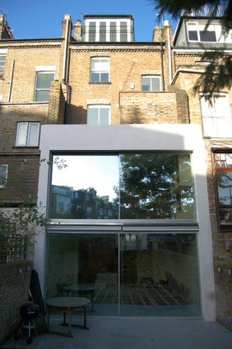
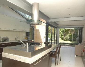
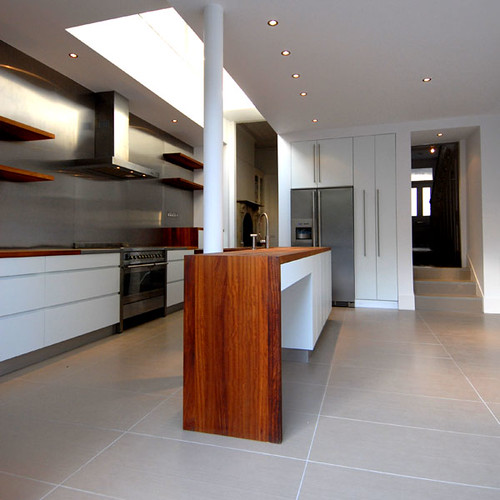
Img from Livingetc forums "Fulham home"

Home renovation is a bit like pregnancy. When you're pregnant, you're hungry for information (well, during the first pregnancy anyway) so you read everything you can get your hands on. You listen ad nauseum to other parents waffle on with anecdotes and advice. You join loads of online discussion forums and swap notes with other mums-to-be. But once the baby arrives, that's that done with and besides, you have no time any more to spend hours in discussion forums etc - it just doesn't seem as necessary or urgent any more. (Until the baby is ill of course).

With this renovation bug I'm scouring design websites for inspiration, re-reading old issues of home décor magazines and hunting for other blogs that talk about the exact same thing that I'm going through. I find myself frustrated with bloggers who only update once a fortnight, or those who post without any photos.

But this week I've made two important discoveries that have helped satisfy my renovation angst.

Firstly, the ultimate topical "news" page for whatever subject takes your fancy. It doesn't look like much at first glance, but check out http://alltop.com - the section that really bakes my potato is http://design.alltop.com - every major design website or blog that I currently bookmark and have to remember to visit is listed in one handy page. I can zoom over stories and see what's new or interesting and click through to read things more in depth. It saves time and gives a satisfactory hit every few seconds.

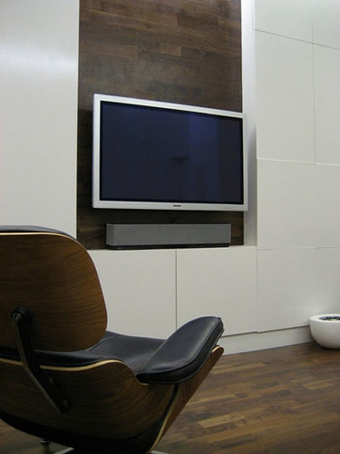
The second is the "See my home" section of the Living Etc forums where basically you can peruse readers' photos of their own adventures in redecoration. It's just a little bit addictive. And check out this fantastic shot (above) I found on these forums of a great storage/TV wall. The design feature of using the wooden flooring on the wall is genius - I warned you it was a bit addictive!


Thursday 27 March 2008

Love me tender (document)


This is a double height extension on a narrow Victorian property, so I don't really know why I've included it, other than I don't have a relevant photo to go with this post.

So, what's happening with the actual build?

Not much.

The tender schedule document won't be finished until next week. It's imperative that everything gets included (from which way the joists are running internally, to which walls will be demolished, to structual information, everything we actually want built etc etc) so that the builders can give an accurate quote. This will probably take a few weeks after we've supplied the tender document. Once we have the quotes in, we then have to wait for the builder to have a 12-16 week gap in their schedule in order to start the work.

Way back in December when we exchanged contracts we imagined moving in around May or June, but this looks to be more like July or even August now. The glass for the extension takes 9-12 weeks to manufacture and this can't be ordered until the extension walls are built, so it's possible that we'll end up living in the new house while work is still going on (great with two small kids) or we may have to sell our flat in order to finance the cost over run. Neither of these outcomes is ideal so I'm going to not think about it for a while.

When we originally bought the house I was a bit ambivalent about moving as we're close to the tube and the local school, a great drycleaner and loads of useful shops. The new property will mean having to get up earlier and being more organised about getting supplies in. But I have to admit, after so many conversations with our architect and his fabulous assistant I am starting to get VERY excited about how our house could turn out and am anxious for things to kick off soon (as I'm sure you are too if you've been reading this for the last month!)

POSTSCRIPT (24 hours later) - the tender document has just been despatched to the first of three builders. I was really excited until I read this post on another building blog which said they were waiting for 8 months to get a quote in - argh!

Monday 24 March 2008

Imaging the extension, part 2


Img from The Guardian Weekend magazine

I never read anything about gardens, and find it really hard to get excited about anything to do with outdoor space. Friends who've acquired a garden wax lyrical about the soothing properties of ripping out weeds and planting herbacious borders, and while I can appreciate that this might be more fun than falling over drunk on occasion, it doesn't really float my boat. Yet.

Having said that, this weekend I spotted this image which shows a wooden floor, leading to a wooden deck, which leads to a similarly sized garden to the one we'll end up with. And again, dark bi-fold doors. And I must admit I was quite excited by the thought of having an outdoor space to create. I've heard landscape gardeners don't come cheap so the garden will definitely be the last thing we tackle. But I'm going to keep an eye out for interesting ways to use the space which will answer all our requirements (herbs and fragrant jasmine for me, grass for the kids and low maintenance everything for the hubby).

Saturday 22 March 2008

Imagining the extension


Image from LivingEtc


I seem to have aquired a lot of photos showing black folding doors, which is quite weird as I thought we were being really adventurous and bold. This image illustrates quite closely how I imagine our extension will look - with folding doors, a similar sized garden and wooden floors.


Instead of a solitary skylight we'll have about four metres of glass on the ceiling running the whole width of the room, also I think we're laying our floor running across the room rather than down it. This serves two purposes - it makes the room seem wider, and it also won't draw your eye to any issues if the lines don't exactly run straight. We're completely sold on the bamboo floor, but I must check whether it's from a sustainable source and if the glue is free of toxins and nasties.


Thursday 20 March 2008

Stairs without balustrades


Image from wallpaper.com

Here's an example of a staircase which uses a wall, instead of a balustrade (or banister/baluster combo). I like the clean lines and minimalist aesthetic, and am hopeful that it won't date in the same way that regular balustrades inevitably do. A wall should also be far less bother to maintain. The stairs in our current flat are enclosed by walls and the worst thing that's happened is a bit of green wax crayon from a visiting toddler (my own children, so far, haven't drawn on any walls!).

Wednesday 19 March 2008

Tiles 'R' Us


Here's our youngest choosing some tiles at the weekend. I can appreciate her aesthetic sensibility, they were small, square, glass and black, all of which are fine attributes in a tile. This particular tile had glitter embedded in each one though, which hubby firmly objected to.

I don't know how long normal couples spend arguing over various finishes in their homes, but this seems to be an area where we actually operate in some kind of parallel universe and actually agree very quickly. We decided to start at the lo-end of the spectrum, Topps Tiles (which is where we got our plain square white tiles from last time) and move up to Reed Harris and Fired Earth next weekend. The theory being that we'd rule out the cheap options, find something perfect in the high end ranges and see if our architect could source them cheaply from his Iraqi tile manufacturer.

As it transpired, we found some tiles we were happy with at Topps Tiles - they're called rectangular mosaics, so they're like little bricks ie wide and short. Hubby suggested laying them upright (so the tiles would be thin and tall) but in a small room I think it best to lie them longways, to give the illusion of width. The options with tiles this shape is to lay them like bricks, ie the row above sits halfway over from the row below, but we decided that it'll look better to lie them in neat repeating rows (again helping the sense of spaciousness).

On the colours - I like gunmetal grey which is quite dark, and hubby likes a more oyster grey. We'll discuss this with the architect as he may have a view. We haven't found any floor tiles yet, but they'll depend on which colour the wall tiles are as black flooring might look too harsh with dark walls and dark grout. Also, must ensure the tiles are sealed properly this time round as dark colours and toothpaste is asking for trouble….

Saturday 15 March 2008

Bargain of the century


So today was spent as Saturdays often are by people in the throes of a house renovation: hurtling up the A13 to visit every "retail park" that was open. We managed to cover off Gallions Reach (waste of time, and wow, what a revolting smell - thanks to a nearby sewage treatment plant), the Beckton Triangle (so-so), the Gateway Retail park (I wish these last two places would have proper websites with full store listings) and finally Lakeside.


We were on a mission to find the perfect fridge, widescreen TV, bathroom tiles, carpet and various items of furniture. Most of the things we were after you can track down online for less than you'd pay in-store, but we wanted to see things In Real Life first.

The reason for this post is that in our current abode we have had the same black and white zebra print rug for nearly nine years and it's clearly seen better days (well, the white bits have). The last time we were at Ilva we'd hesitated over spending £199 on a new rug. Today however, I was feeling particularly fed up with our zebra rug and was interested in checking out what was on offer.


To my horror the pattern we'd liked when we visited a few months ago wasn't on display, so I started to sort through the piles of miscellaneous stock. A few of the rugs were on sale. And eventually I found the patterned rug we'd liked but it was missing it's price tag. After a bit of rummaging I found a rogue tag - it said £50 for "green cross". I called over an assistant. Yes, the rug is indeed green cross, what's more... "You can have it brand new for £50 or if you don't mind taking the one that's been on the shop floor as a display rug for a few hours (it was laid out this morning) then it's £25." Well heck, it's virtually free at that price. I couldn't believe our luck and promptly inspected the rug (absolutely fine) and freed it from Ilva's cavernous clutches.


The celebratory dinner we had at Nando's afterwards cost more than the rug.

Friday 14 March 2008

Action Stations


mydeco.com has a nifty "taste finder" tool which helps articulate what it is that you're into. It's called What's your style? and takes about five minutes to do - simply click on the images that appeal to you (NB the grey squares are not colour swatches, they mean "nothing from this selection").

I guess it's no surprise that my taste came out thus:

"You are Family Mix.

You've got a great sense of style and it's one that you manage to combine with the more practical needs of a family, mixing items that are relatively disposable with other pieces that may become the 'antiques of tomorrow'. The retro look is fun and appealing; what's more it can now be achieved on almost any budget."

Which is a relief, as our budget seems to be evaporating daily. Just the list of sanitaryware items for the bathroom sucked up the entire bathroom budget and this is before we'd costed out a plumber, tiler, or soil pipes and actual tiles. Hubby was horrified when I suggest we try and tighten our belts for the foreseeable future a bit more "What? And not go out?!" he spat "And how much will that save? A few hundred quid? We need to save thousands!" I must admit it was like our brains had been swapped as he's usually the one to suggest belt tightening while I break into a cold sweat.

Oh dear, I just did the test again and changed my answers (some of my choices were a bit rushed before) and came out as "Action Stations" (see photo above).

"For a family home your style is surprisingly masculine. Perhap's it's due to the gadgets you own, though more likely to do with the choices you make when it comes to the colour and functionality of design. Chances are, perhaps, that your busy lifestyle adds an element of unavoidable chaos to an otherwise orderly and disciplined aesthetic."

This is true actually, our current flat is pretty masculine and minimalist, well, it would be if we didn't have kids stuff strewn everywhere...

Thursday 13 March 2008

Designing a beautiful bathroom


Image from idfxmagazine.com

This is why you use an architect. They just think of the most useful ways to incorporate whatever it is you need into a visually satisfactory result. As previously mentioned our bathroom is going to be relatively teensy and we need storage for towels, maybe a laundry hamper for dirty clothes and room for all our unctions, cosmetics and First Aid items. Anthony is keen to build a unit along a wall which houses pipes, a cistern and storage similar to the one shown here - ie: a wall hung loo (which makes the room seem less claustrophobic as you can see more of the floor, also better for hygiene as easier to clean underneath) and a plinth or long cabinet which can host a basin. Along the wall he's drawn in large mirrors, but after a visit to The Bathstore I'm wondering if we can use four mirrored front steel cabinets (£79 each) as this would have the same effect but provide valuable shelf space.

Refer earlier posts on the kind of look we're going for in the bathroom (small tiles, probably square or rectangle mosaics, in a dark colour, with larger tiles on the floor, masses of overhead light etc).

Currently we've got a massive fixtures and fittings list to fill in which means more visits to home related stores this weekend, a structural engineer to engage so we can order up a steel beam to support the house when the extension goes in and any day now we should get a full outline of the building works which needs to go out to tender. If anyone has any personal recommendations for a particularly good builder who can work in East London, please let me know.

Wednesday 12 March 2008

Making stairs multi-tasking

I can't remember where I found this photo but it's such a clever idea. If we were going to have exposed wooden stairs I'd really push for this, even if the last two or three stairs were drawers they'd hold enough shoes, toys, magazines or general debris to reduce clutter.

One of hubby's obsessions is tidying the house before our cleaner arrives, which happens twice a week. This always causes stress for both of us - he gets upset at having to re-pack the water bottles, prams and piles of shoes under our stairs while I get upset getting harassed to "clear surfaces". I'm sure the cleaner's used to dealing with piles of miscellaneous rubbish in people's homes, but if we had more incidental storage it would make life so much easier.

Sunday 9 March 2008

Tiles and bathroom fittings

We had a design meeting with the Anthony and Amy (our architect and his assistant) and now have a heck of a lot of things to find - ie: a list of the actual sanitary items we want to see in the bathroom, the tiles etc. We had a hasty visit to a local tile shop on the weekend but it didn't stock a single sample of anything we want in our home. It was all natural stone in various shades of brown with rough hewn finishes. Urgh.


Also managed a flying visit to a local branch of the bathstore.com (which always seems to have it's entire stock on sale... don't be panicked into thinking you need to buy immediately, we've been seeing the same "sale" promotion for more than five years now...) It was easy to find a wall hanging toilet, basin, taps and heated towel rail from the selection as we identified items similar to what we've got now. I'm liking the soft close toilet seat lid though (£40), that'll make a difference with the kids.

Anthony talked us out of the beige kitchen pointing out a white one will fit with the white walls/ceiling etc and look more streamlined. And an absolute genius idea he had was to make the wall up to the stair rail continue upwards so there's no need for a banister. This works on a couple of of levels - firstly we can now have carpet on the stairs, as you won't see the ground and middle floors when you arrive (I wasn't keen on having uncovered wood on the stairs, noisy and expensive) - apparently it can look odd to have a different stair covering to the floor, aesethetically. Also, it gives lots of wall space, ideal for hanging art/photos or just making the room feel more impactful.


The photo above shows another black folding door example, in a room a little narrower (I think) than ours. Our roof will also have glass in the extension bit (about 4m all up) so the light should be similar. Speaking of light, Anthony's found a Velux roof window that is nearly 1600mm wide, so it'll effectively be the entire width of our bathroom.


The next step is to put the project out to tender to a few builders, this is going to take 2-3 weeks. The party wall survey still has to be carried out. We've had the keys for nearly a month and nothing's due to start happening in there for probably another month...

Thursday 6 March 2008

Ground floor kitchen

kitchen

Image from livingetc.com

This is along the right lines for our extension, ie: the kitchen leads into a living area which is separated from the outside world by glass. This image shows black folding doors which are similar to what we've chosen (well, they're black, and they fold...)

Our room will be long and quite narrow, so it needs to have good light and the right colour scheme inside to make it seem wider. The bamboo flooring samples arrived today, and the finish actually looks quite good. The price is great too, coming in at about a third the cost of engineered wood. I originally wanted poured rubber or highly polished concrete but if we spend the money here there won't get any left over to pay for anything else.

Hubby's not too keen on having wood in the kitchen again (hastily cleaned up spills always show up and it scratches easily) but having the same flooring throughout will help the space seem bigger. Plus it's more cost effective when you buy more of something. Anyway, I think bamboo will be a good compromise as it's really hard wearing, apparently it's even good in bathrooms.

I've just taken a Le Creuset cassorole pot out of the oven and it really peeved me to have to bend over and haul it up to to the hob - it's really heavy - so a wall oven is definitely going in the new place!

Wednesday 5 March 2008

Existing kitchen layout

sunny kitchen


We've visited the house at a few different times of the day and it's great to see that in the afternoon the sunlight pours in on the upper floors. (Our current flat gets sun pretty much all day, and the light is often so bright we need to wear sunglasses inside.) As we're turning this kitchen into a spare bedroom slash office with a 'family room' on the sunny side of the wall I'm keen to harness the light right through if possible. Ideally we can make part of the wall transparent, or maybe the door will be positioned to let enough light in.


dishwasher

What you're looking at here is where a desk will end up. The dishwasher you can see will be hocked on eBay maybe, and our new one will be integrated into the downstairs kitchen. You can see where the services (gas, electrics, pipes etc) run down the wall on the right-hand side. This protrusion has to stay, but we should be able to incorporate it into the layout to be a subtle feature, the end of an inbuilt bookcase or something.

The window sill has been made out of the same laminate used on the bench tops, gee, how practical. Cutting onions on a window sill has always been a goal of mine. [Note - I am kidding]. I don't mind some of the design features in this property - the tiling for instance is better than the effort in our current abode. But if you're going for this kind of streamlined 'modern' aesthetic, wouldn't you try to make the skirting boards and the finish fit the bill too?

Anyway. I've been watching hours of Grand Designs and reading back issues of Living Etc. When you're hungry for inspiration a month between publish dates seems like an eternity! Grand Designs has been particularly useful at putting things into perspective because we're not building from scratch. Though depending how this remodelling goes it'll either make us desperate to do a project from the ground up, or shelve the idea forever...

Have found a great site called The Lazy Organizer which is going to be very useful in the forthcoming months!


Tuesday 4 March 2008

Architects plan - side view

side view

The meeting with the architect last week was useful, if a little long (am I the most impatient person on the planet? Maybe.) This is the side view of the property, for what it's worth.


The best news was that the architect had actually been to California and seen two of the Case Study Houses in real life, which is a bit of an amazing fluke as we had no idea he was into the same style of architecture as us when we chose him. Actually, he chose us: because he lives 4 mins from our current flat and his work premises are close to the new house he agreed to do the job. Despite the fact our budget's about half what he'd usually deal with on a residential build. Yay.


The trip to Ikea to look at kitchens last week was actually really useful. Hubby and I agreed in 3 minutes flat on a kitchen (high gloss white, either with tiny handles or preferably no handles) and counter top (either moulded acrylic ie: budget Corian, in off white) or a black high gloss stone (depending on availability and practicalities). We managed to get out of there after spending only £43 on stuff we didn't really need.


After perusing the latest Ikea brochure over the weekend we decided that actually we liked their retro beige kitchen, and it fits quite nicely with our Case Study House aesthetic. We have a design meeting with the architect on Friday to sort out these kinds of details so we'll see what he thinks before making a decision.


Flooring is going to be an issue as I really didn't want wood again (sick of the scratches and maintenance) but it really is one of the more affordable options, and it does look great. We looked at Amtico which is an almost impenetrable surface that mimics wood, but we both decided that it's kinda naff. I suggested bamboo - it's hard wearing, comparitively cheap and it's eco-friendly - so hubby's sorting some samples.

Monday 3 March 2008

Kitchen inspiration and fridges

kitchen


This is the sort of aesthetic I like for a kitchen - lots of white, wood and slate. My current kitchen is lots of wood and white tiles. I still love the wood but I really hate those tiles. It doesn't help that they don't sit completely flush thanks to our flakey builder.

When we stayed in Florida two weeks ago we agreed that the American style fridge (ie side by side, with ice and chilled water on tap) made perfect sense. It was also ecologically better than drinking water from bottles (as we do now) because a litre of water is used to manufacture the plastic bottle, such a waste. We agreed that if the water was filtered and chilled we'd drink it, so goodbye to the piles of bottles we need to recycle each week.

People have been asking if we're living in the new place yet. The answer is a firm no. There is so much building work to be done that it's just impractical with two small children. We'll be paying two mortgages (arrgghh!) for the immediate future. Hopefully no more than three or four months, but we know that the glazing can't be ordered until the extension is nearly finished, and once we order it there's a 9-12 week delay. So I guess it could take longer than four months all up. Once we're ready to move we need to repaint our flat and get it ready to rent out. I'll keep you posted, literally.

More bathrooms

bathroom

Image from wallpaper.com

Here's another narrow bathroom with dark tiles. Our bath will run the width of the room just like this so it's useful to get an idea of dimensions. There's obviously a light source directly above, which shows how even dark walls can look OK, and the room doesn't need to feel claustrophobic.


another bathroom


This shows how our ceiling could end up, ie: with sides added to seal off the loft space, which leads up to the Velux. Obviously I'm not a fan of this colour scheme!

Tasty bathroom

beautiful bathroom

Image from wallpaper.com

As mentioned the new bathroom will be about 2/3rds the size of our current one, and we're addressing the lack of natural light with the addition of a Velux window (probably one that opens with a remote control).

This is a photo of a similarly sized bathroom which I really like. The small dark tiles look like they'd wear better than our current big, square, white ones - which weren't sealed properly so the grout always looks like it needs a good scrub. I'm a fan of natural wood too, and the plan is for the architect to design something bespoke to house the pipes and towels.

We had a meeting on Friday morning and discussed bathroom options, instead of a steel bath (which isn't very sensible as it doesn't hold heat) he advised us to go for a Villeroy and Boch Quaryl thing, which retails for about £500 + VAT. Ouch.


Another suggestion he had was to avoid visual clutter by filling the bath using the overflow and a bath filler. This means there'll be no taps in the way when you have a bath too, brilliant.

I really wanted a dual shower head option - one fixed to the ceiling, with another hand held for hosing down surfaces but apparently having a triple mixer (shower head, hand held shower, bath filler) plus a thermostat is a really expensive unit, so I've been talked into just having the hand held... good job I have this blog so I can keep a tally on the compromises!