Wednesday, 30 April 2008

Wacky wallpaper


Apologies for the rubbish quality of this photo. It's a snap of a bit of wallpaper designed by Scottish duo Timorous Beasties. I'm not really into wallpaper per se (it dates, I doubt I could hang it straight, I might get sick of the design, I'd feel bad about paying someone else to strip it off because I'm too lazy to do it myself etc etc) but if I'd had a boy then I'm pretty sure this would be going up in their bedroom.

It's a great urban scene featuring a skateboarder, BMX riders, TV antennae, road barriers, CCTV, a lamp post, and more. It's familiarity is kind of soothing and pleasant to look at. I'd feel nauseous having to live with a pastoral scene or somesuch, but this I could tolerate.

Monday, 28 April 2008

American style fridge


Hubby and I had a splendid time in Florida a couple of months ago, and there were two things the Americans include in their kitchens which we decided we'd like too.

Firstly, the side-by-side fridge/freezer. Not only does it hold a whole lot more stuff than our current under-the-counter side-by-side arrangement, but these fridges have water plumbed into them. Which means ice cubes and chilled water at the touch of a button. I'm keen to nix our bottled water habit (plastic is bad, shipping is bad etc etc) and we go through a bag of ice in our house every few weeks. (So we drink a lot of G&Ts, it's normal).

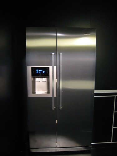
We've looked around at a few of these types of fridges in various retail stores and inevitably there's some design feature that irks - eg the handles are made of some nasty plastic, or the finish looks cheap. But in Milan last week Samsung had a rather impressive display of their new products and I was instantly smitten with this fridge. The blue LED screen looks so much cooler (pun intended) than others I've seen, and look at those stainless steel doors...

The other thing the Americans had in their kitchen which was incredibly useful was a hose attached to the tap. Great for rinsing salad greens, and also good for hosing down grubby sinks. Ikea has a new range of taps which feature a hose attachment, including ones where the hose is hidden inside the tap, it retracts in there when you're not using it. How brilliant is that? As our sink will be facing out into the open plan dining room, I don't want a massive hose on a stick ruining my sight line. I can't believe I'm looking forward to a retractable hose. I used to be fun.

Friday, 25 April 2008

1950s settee


I found this display by Uno Design in Salone (surprise!) and something about the retro style really spoke to me. I didn’t sit on it so can't tell you if it's super comfy, but I love the way it looks. If The Jetsons were decorating I'm sure they'd have a sofa like this, it's both futuristic and retro at the same time.

Maybe this piece of furniture would make more sense in an office environment rather than a home (would it withstand hours of bright sunshine bleaching the fabric? Could you lounge on it and watch every episode of Arrested Development over a weekend? Heck, is the back even high enough to stop your head from lolling about?) - you can see why people who work in interior design need to be clued up. Unlike me. I tend to choose stuff based on emotion, comfort, practicalities and (sadly) price. It would be great to be able to have that visual gene that can work wonders in any space and know how to make the most out of a room.

Like a cousin to the above sofa, I found these chairs at Modus. Again, didn't sit on one so can't vouch for its comfort but can imagine sitting here and wasting an hour or two on the PS1 (I told you I was into retro).

Bathroom cabinet


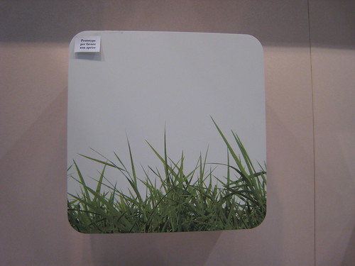
If we have wall space (ha!) then this cupboard would be a welcome addition to the bathroom. I like the rounded corners and the photo-realistic grass. For ages I've been meaning to buy a red metal cross shaped cabinet for our bathroom, thinking it would be great for medical items. As it turned out we've ended up stacking semi transparent Muji storage boxes in our current bathroom, there's no way our medical items would fit into a single red cross shape. I don't think the Muji boxes will fit with our new 'grown up' aesthetic anyway, so they're not relocating to the new house.

Thursday, 24 April 2008

Garden furniture & Metrosnapshot


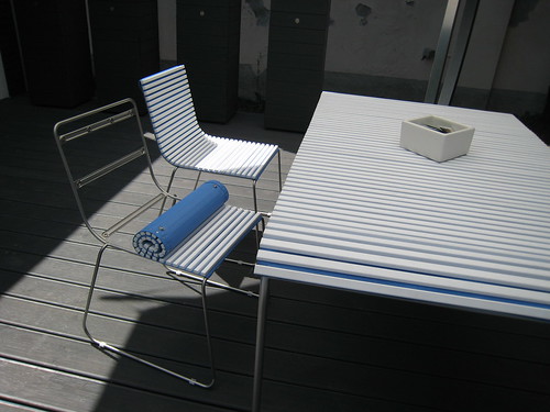
I'm getting way ahead of myself even looking at garden furniture, but it was gloriously sunny in Milan so I found myself hanging outdoors quite a bit. In Superstudio Piu I was quite taken with this ingenious design: you can unclip the covers, roll them off and stack the chairs. The furniture comes in a plastic or wood finish. I've managed to tidy away the brochure so can't tell you the name of the manufacturer, but will endeavour to do that at a later date. It's such a good idea to have furniture which is easy to store in winter - and I'm not a fan of ye olde wooden country style garden furniture (but you knew that already, right?).

A few minutes after taking this photo I met up with Andy Wang from Metrosnapshot for lunch in via Tortona (below). I met Andy at last year's Salone (well, actually we were both in the immigration queue at Heathrow. I'd lost my mobile and he was transiting on the way back to San Fran…) Andy has got the work/life balance thing absolutely nailed - he works for three weeks and then has a week off to go travelling, mainly to design festivals all over the world, which he then blogs about on Metrosnapshot. I can't complain as co-incidentally I'll be in NYC for the ICFF next month but still, a whole week every month… now that would take some beating.


Wednesday, 23 April 2008

Damned Lampshade


Luc Merx "Damned" lampshade

Mmm, a theme. More ceramic naked maleness. Created by another Dutchman. This one's an architect though called Luc Merx (I wonder if that's a real or stage name?). On the MGX website the copy says 'He imagines the lamp hanging above a dining table, the shock of the frozen, terrified bodies disturbing diners with age-old questions of guilt and morality, issues usually kept behind closed doors.'

I can also imagine this lampshade above my dining table, but for me the bodies are less terrified and more vulnerable. Again, no idea how much it costs but unless Ikea start selling this as a mass produced item I doubt we'll be buying it any time soon. Sadly.

Postscript: I've found it for sale here , it's a limited edition of 40 pieces and costs $45,000. Damnit.

Peter Jansen sculptures


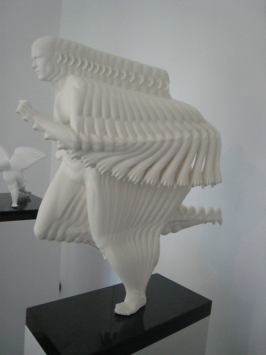
Human Motions, Thomas Flair Runner by Peter Jansen

I have a funny relationship with art, and hubby and I often argue over what goes up on our walls (subsequently, not a lot). We hardly have any photos on display in our home and admittedly, the white walls do look a bit blank. Not that it matters as we'll be moving out in the foreseeable future (Ha! Still no building quotes, it'll be mid May at the earliest before we appoint a builder… I could cry).

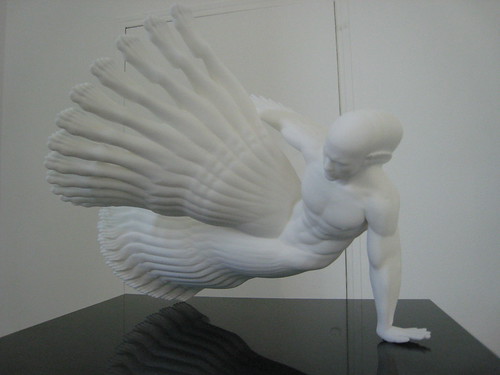
But in Milan last week I found myself completely enamoured with these polyamide models made by Dutch artist Peter Jansen. Aren't they just the most fascinating objects? The actual size was probably not much bigger than a 1.5L bottle of Evian yet the detail and absolute perfectness meant I could quite happily stare at them time and again. Can't find out how much they cost, but I'm guessing it would probably be my entire kitchen budget. For now, I shall settle for these snaps…

Thursday, 17 April 2008

Charles and Marie in real life


Oh quelle horror, still nothing to report and as at last count we had only found two builders who were available and happy to submit a quote. This is making me nervous because unless one of them can do the work for our budget, the process could start again (ie finding more builders and waiting another 3 weeks for more quotes). We can't carry on paying two mortgages and waiting. I'm feeling a tad anxious.

On the good news side, I've just spent three days in Milan hanging out at the Zona Tortona which is part of the Salone del Mobile ("the world's most important industrial design and furniture fair"). I spent many hours walking around via Tortona, taking over 200 photographs of various products and I still think I missed half of what was on show. When you've looked at so many products it's hard not to feel inspired/excited/broke.

I'm going to post various photos to catalogue what I liked for future reference. I may as well given that there are no new pictures of the actual renovation project to share.

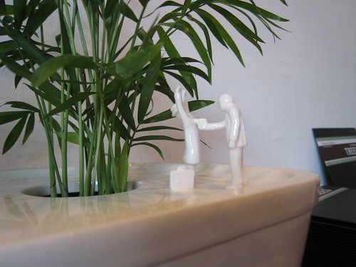
So, on day one I went to the pop-up shop of one of my favourite websites, charlesandmarie.com at 12 via Tortona. The shop was filled with a selection of the witty and clever objects they sell online. I particularly loved the subversive pot plant ceramic holders featuring urban park scenes (eg the pregnant woman being flashed at, someone getting mugged, and a bit of boy-on-boy Hampstead Heath action…)
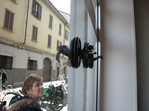
I was planning on going back to the pop-up shop to buy the Moose trophy hangers by New Zealander Phil Cuttance, but as I wandered along via Tortona a taxi beeped at me, and inside was an old colleague who I hadn't seen for nearly a year. I got in the taxi and was whizzed off to the B&B Italia store, it would have been rude not to go, when in Milan etc etc.

It was great meeting Marcus (one of the owners, pictured below) as I'd been emailing him fo many months (work related correspondence, not fan mail). He's planning on opening five C&M stores around the world by the end of the year. Hopefully one will be in London as I'll need to decorate my house by then.

Monday, 7 April 2008

Are you a builder?


Still nothing to report. The architects have drawn up a short list (as in it's a very short list, not a list of the prime candidates) of builders and construction companies to invite to tender. I was feeling more buoyant until I noticed on one of their websites that their residential refurb budgets were generally over £300K. Not in this lifetime I'm afraid.

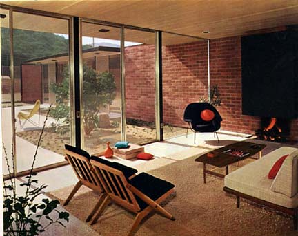
This photo is from a house built around 1963/1964. I love how these mid century properties look so modern and futuristic nearly 50 years later. To me, that shows real foresight - imagining how people will want to live. I know we probably won't be living in our new property in ten years from now so I don't feel bad about having such a tiny budget, after all, we can always replace the fixtures and fittings when we have more money if we decide to add value. But I am sure the work we are planning to do will create a superior space which people will enjoy, I don't know if it will last 50 years but here's hoping.

Anyway, currently waiting for more builders to indicate they are happy to tender and they're available to start the work in May. Apparently there's an economic recession looming and the housing market is set to implode yet every builder the architect has contacted is either busy or our budget's too small.

If you know of any London based builders who aren't total cowboys, please get in touch.

Wednesday, 2 April 2008

Solving space issues


I've always loved sliding doors. In the 1970s as a child they looked futuristic and modern to me, despite wobbling when you closed them. Now some 30 years later sliding doors have been improved ten times over and slide effortlessly, as well as looking far more integrated and streamlined.

I suggested using sliding doors early on in our conversations with the architect, but after thinking about paying more than £400 for a door (and we'd need four of them), it didn't make sense to pummel our modest budget on something so "frivolous". However,
Living Etc did a feature on sliding doors a couple of issues ago which I recently re-discovered, and it set me off on this tangent again.

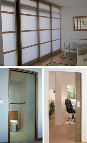
The door on the top of this image is a Canto room divider, custom made and stained to order from
Draks. It costs from £400 for a 1500mm width door. The door on the bottom left is a pocket door, and costs from £230 for the sliding mechanism and £147 for a door (in your choice of style and dimensions) from Doorhaus.

I ruled out both of these because of a. Cost and b. I didn't like the wooden frame on the Doorhaus version, but then I found out about about another pocket door system which costs from £199 for the mechanism (you can choose your own door from anywhere) from
Royde and Tucker. As you can see, it looks perfectly integrated with the wall.

Royde and Tucker designs and manufactures bits to open and shut doors (they used to just do hinges but have branched out). They've developed a clever "Z" section slide, which means the mechanism can fit into any height. All the bits are to hand in the UK, so if you order a system it can generally be delivered the next day! Similar systems from Europe or the States can take up to six weeks to arrive.

Having a room unencumbered by a door means it will be easier to place furniture, and gives the feeling of more space - essential given that all our rooms will be smaller than the ones in our curent flat. Sliding doors are back on the menu…