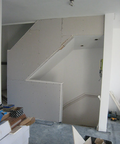
This might not look very interesting, but it is. These stairs originally had a 'dog leg' and the bottom four turned at a right angle. This is necessary if it meant continuing down the stairs would put you face first into a wall, but as we had removed the wall it meant we could straighten the stairs out. I prefer this look as it's more modern and streamlined. This was one of Anthony-the-architect's ideas early on in the discussion process and it's really quite satisfying to see it in reality. Dog leg stairs are fine in period homes, but for modernists they're not at the top of anyone's wish list. We'll still have a dog leg upstairs though but it won't be so noticeable as the stairs are now cloaked in the waist height wall (replacing the ugly wooden balustrades, see photo below). This will look fantastic once it's been plastered and "made good". For true fans of alternative stair ideas, check out this photo blog called Stair porn.


3 comments:
I would have left them open personally, to be truly minimalist...
Yeah that's exactly what Anthony suggested 2 weeks ago, but we're not minimalists, we have kids...
The Architect responds:
MINIMALISM is all very well when you have a big budget: with detailing, less costs more. Furthermore architecture is a game for adults: kid kaos means klutter: for example, David Chipperfield keeps his own kids play space hidden from view, constrained to cupboards in his own gaff, to uphold the purity of an idealised domestic aesthetic.
MAXIMALISM is idealised pragmatism. Let the domestic interior spaces breathe with the characteristics of the occupant. Their kids. Their dodgy travel souvenirs.
--
BTW: open stairs would increase the openness of the living space. Nothing minimal there, just maximising living room! However this detail doesn't make or break the project.
Bon bldg blog!
Post a Comment